Site updates

It’s very minor, but the cast list in my stories has become slightly broken. If you look at the latest one, for example, you can see that the cast is now listed all on one line, where before, it used to be each on separate lines.

If this just needs slightly different markup, I’m happy to add it in on all my stories, but I’d rather know beforehand what I should be using instead of having to experiment. (Also, if I can indicate that the lines shouldn’t be indented, that’d be even better, but that’s not really a big deal.)

Hi Robin,

good that you’ve noticed that.

The easiest way to fix it would to prepend each line in the cast list with a * or a - then it’s rendered like this:

  • entry 1
  • entry 2

That should be fine. You can use a headline, which will not be indended, by starting a line with two or three # (hashmarks),

So this example:

### Castlist
* Member 1
* Member 2

should be rendered:

Castlist

  • Member 1
  • Member 2

Would that fit your requirements?

Since the previous bright layout is straining my eyes and because I’m a fan of dark designs, I’ve added a theme support to GSS.

The default theme is a dark one (called Slate), but you can still select the old one, which is now called “Classic”. And a number of other designs, which you might find pleasing to your eyes.

2018-08-16

  • Added theme support and a number of themes (select one in the menu on the right of the menu-bar).
  • Various smaller layout and dialog fixes
2 Likes

Yeah, I was thinking I might want to try a bulleted list. Thanks!

Themes look good but… where’s the Win 3.1 Hot Dog Stand theme… j/k the look great!

3 Likes

September 2018 update

I’ve just uploaded a huge update of the site.

At first, I just wanted to update the internal UI library, called “Bootstrap”, to its latest version (from 3.2 to 4.11). For no real reason other than being up-to-date.

That required reworking about all the pages of GSS. Every single one had to be laid out from scratch. If I had only known what this update would mean…

Anyway, while doing that, I’ve also implemented many of the things I was planning to do for quite some time.

Here are the highlights:

Changes for all users

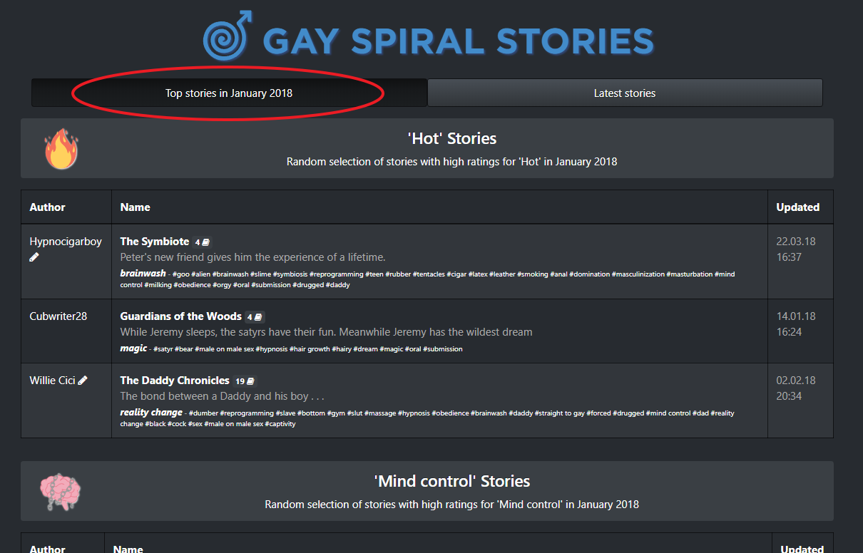
A new “Top stories of the month” feature is now available on the main page:

This is a list of the best stories that were published in a given month. For each rating type, a number of the highest rated stories (or the series they belong to) are listed. The order in which the series are listed is completely random and doesn’t reflect any ranking!

Throughout September, the list will show the best stories of January 2018. In October, the list will switch to Februrary and so on. There are a lot of ways in which I could tune that list, so feel free to give me your suggestions and ideas for this!

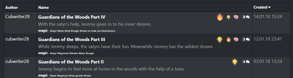
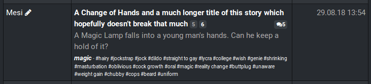
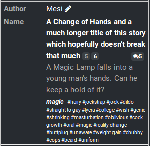
Added “Excels in…” icons to the story list:

Up to three “Excels in…” icons might be displayed with each story in the list. The leftmost and biggest icon denotes the category for which the story got the highest ratings. Up to two additional icons can be shown for the “runner-up” categories. Only if a story got high enough ratings for a category (at least an average rating of 4.0 or higher), an icon will be shown here.

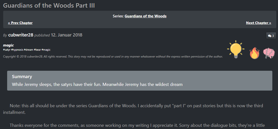
The story display is renovated and the “excels in…” icons are shown there as well:

The story’s summary is displayed now (which was curiously missing previously) and the series is shown more prominently. And the new “Excels in…” rating icons are shown here as well, now, they work exactly the same as in the story list described above. Tooltips explain the icons.

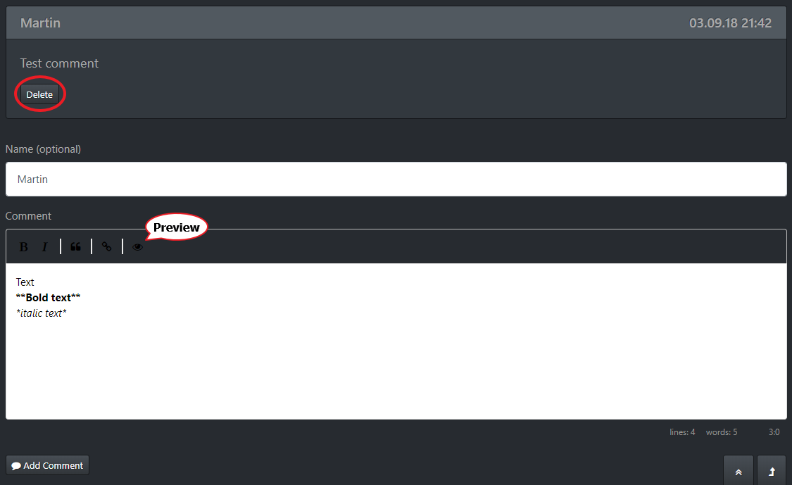
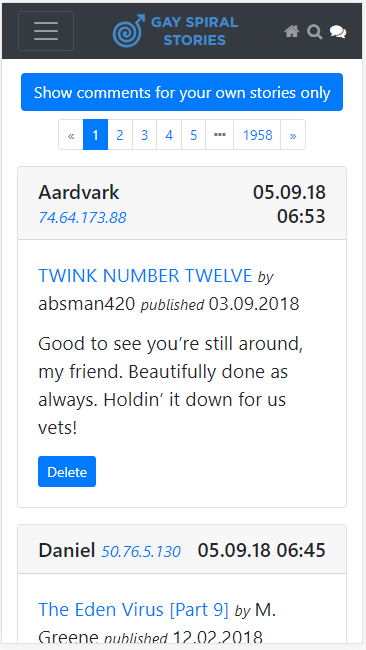
Writing comments became easier and comments can be deleted now:

There is now a toolbar above the editor to make it easier to add simple text formattings. The editor also features an English spell checking now. A preview button allows to see your comment how it will be shown on the site after it has been added.

Everyone can now delete a comment he’s just published with the “Delete” button - in case you’re not happy with it, you can now delete and rewrite your comment, if you want to. Logged in users can always delete their comments, even later.

Changes specifically for Authors

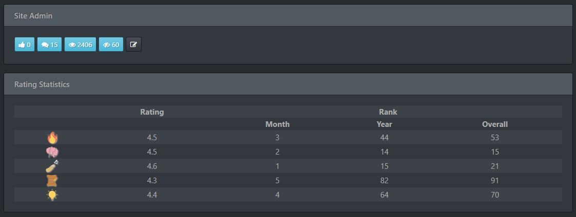
Rating statistics have been redesigned and include the stories’ rankings now

The complex statistics, that were displayed previously, are now condensed into a single column under “Rating” (showing the average rating, from 0 (lowest) to 5 (highest)). A more detailed set of statistics is shown in a tooltips when hovering the mouse over (respectively touching) one of the numbers.

The “Rank” part is completely new. It shows how well your story does compared to other stories released in the same month, the same year and among all of the stories on the site. For a story to be considered for this ranking (as well as for the new “Top of the month” list) it has to have been rated by at least by 10 different people.

Please remember that the rating has been implemented in January 2018, so there are only very few ratings for older stories yet.

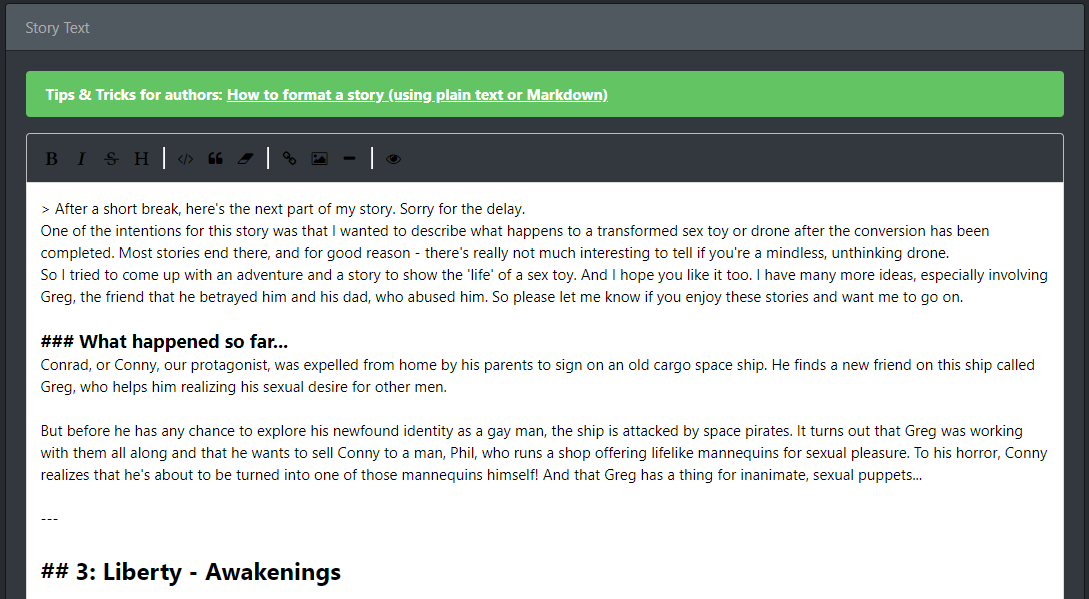
WYSIWYG editor added to story submit and story edit page

The Markdown WYSIWYG editor has also been added to the story submission and edit dialog. You can use the toolbar icons to format the text. The “Preview” button gives you a very good idea how the story will look on the site.

It’s much easier to insert links now and even images, without having to deal with the awkward Markdown syntax.

And, finally, the editor will automatically remember the latest version of your text in the browser storage on your computer. So if you close your browser before submitting your story, you will return to your story in the exact same version as you left it, once you open the story submission page again.


Other changes

These were the major changes, but for completeness’ sake, here’s the list of all the smaller and internal changes:

  • Reworked the “NoScript” warning, age-verification and cookie notification
    • The “NoScript” warning will now also show up if you’re using a script blocker. The site is practically unusable with an active script blocker. We don’t download any external code or other contents from the web (with the exception of Google Analytics) and since there aren’t any ads on the page either, it’s really pretty safe to turn off the script blocker or put the site on its white list.
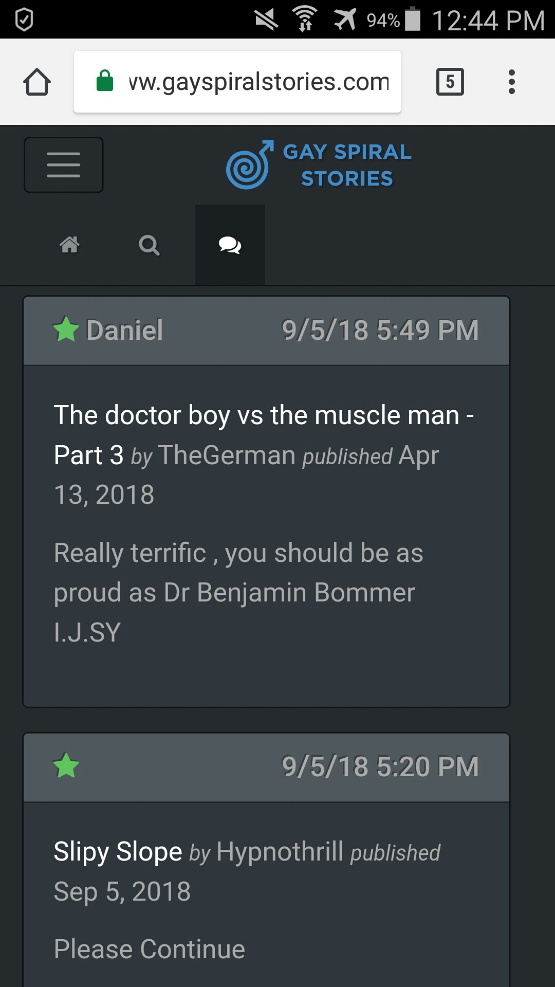
  • List of comments redesigned and optimized
  • Search page redesigned and fixed
  • Changed date/time display throughout the site to use the locale setting and time zone of the user
  • All UI themes have been updated and some new themes for Bootstrap 4 were added
    • You might want to check out the new “Sketchy” theme, which is really fun!
    • Thanks to www.bootswatch.com for offering those themes to the public.
  • News (including the newsflash) are now using Markdown as well
  • Replaced glyphicons with Font Awesome throughout the whole site
  • Tag Management page redesigned
  • User Management page redesigned

Please feel free to comment and criticize!

And since I’ve changed about everything everywhere, it would be a miracle if there are no bugs. Please let me know about everything that seems strange or is just not working, so I can fix it!

Another thing I want to mention are those great icons, our user Foxtrott created a couple of months ago. They finally get the visibleness they deserve!

5 Likes

I think I like everything so thumbs up on all your hard work.

I will comment that I’m glad that “Latest Stories” seems to be the automatic location at arrival so thumbs up on that.

Honestly great work. Awesome stuff.

2 Likes

Thank you for all your hard work, Martin. This is amazing!

2 Likes

Thanks guys :slight_smile:

The default “landing plattform” is “latest stories”, of course. I realize that this is what most people are looking for. However, after that, the site remembers the latest selection. And that’s actually really required, otherwise when browsing through either the “Latest stories” or “Top stories”, it would be a real nuisance having to turn back to the category you’ve been browsing.


One thing I forgot to list:

  • Updated the “springsecurity” plugin. That seems to have fixed the issue that Chrome browsers (mobile versions) were failing to retain the login when visiting the site again later, forcing a new login each time.

Would it be possible, to give a link to the latest part(s) of a series on the Home page? There once was a time, were I could click on the title of the story and directly got to a certain part of a series. If I wanted to see a list of all parts I clicked on the book icon behind the story title.

I assume this differentiation was given up as single parts where grouped together as a series on the Home page.

What about keeping the title linked to the series page but give additional links to (the first one and) the last two/three parts – not necessarily with a book icon and preferably with a different :visited color, so one can see (without cookies/ being logged in) which parts were already visited. E.g.:

The Mind Locker [1] … [7] [8] [9]
or only the latest parts:
Unconscious Rewards [6] [7]

At the moment on the Home page there’s no link to visit a single part without visiting the series page first.

Well, actually that was a concious thange I’ve done a couple of months ago, because I really hated that clicking a series header would directly put me to that story instead of the series, where I could see what other parts I might have missed.

But of course, that’s more of my personal problem, and you’re right, that clicking the “book” icon would have helped there, too.

So I’d ask the other users: Would you prefer to see the old behaviour back? Or do you prefer the Guests suggestion of putting up direct links to the latest chapter(s)? I’m afraid with the little space available on mobile phones, that might prove difficult…

THANK YOU, MARTIN! These changes must have taken a great deal of time and energy. We all really appreciate it. You’re the best!

1 Like

[The Guest who proposed this]

I did a graphical mock-up how that could look like. Space is a thing to consider, especially on mobile. But two clickable part numbers should not take up considerable more space than the book icon now:

Bildschirmfoto%20vom%202018-09-04%2014-35-21

I understand, Martin, that you hated clicking a header and not knowing if you get to the part you’d really want to read (I didn’t like that, too). That’s why I proposed this solution and to keep the header linked to the whole series.

By the way: At the moment I sometimes help myself by clicking the comment icon and scrolling back up.

1 Like

Amazing job Martin, thank you so much. The site is truly lovely. :heart_eyes: One thing I’d like to point out though, is that on mobile, the header for Gay Spiral stories seems to be blocking the button that says “show comments from your own stories”. It’s not a big deal, but I’d thought I’d bring it up. Great work regardless!

1 Like

Martin, this is all excellent! Major thumbs up!

If I might throw a suggestion in the box here for Top Stories of the Month:

I’d really love if there was a way to differentiate between single chapter stories and new chapters to a continuing story when looking at the top rated stories for a month. The issue I see is people that are invested in a continuing story are going to read each new chapter and are more likely to rate it based on their feelings for the story as a whole rather than the chapter’s individual merits, which is fine I suppose, but it will likely drown out individual stories because they don’t have returning readers. It could also cause stories that run for months to take the spots each month, which again, isn’t necessarily wrong, but it might also have the effect of taking top spots from stand alone stories.

Then there’s just the matter of personal preference. I personally like shorter stories and can’t really get invested in the longer ones for too long. I’d appreciate if there was just a way to filter down short stories to see the best of them.

Just something to consider. Thanks for the hard work!

1 Like

Great changes! Keep up the good work!

1 Like

I’ll try to find a solution. Thank you for the suggestion!

Hm, that’s very strange. I’ve actually tested that (in the Chrome Developer test where you can simulate various mobile device sizes, and on my own phone) and it looked fine to me.

This is how it’s supposed to look like:

Could you please post a screenshot of this page as it looks on your device and give me some details, like which device you’re using and which theme you’ve chosen?

I see both of your points. Actually, I’m struggling with the format myself a bit.

One easy solution would be to widen the scope a bit. Maybe one month is just too short? Right now, I’m presenting 15 stories per month. That’s quite a lot already.

I’ve been considering to use a quarter-year or even half a year, instead, but still change the selection of of stories shown on a regular basis.

The code I’ve written actually can do that already, it creates a list of series with the best rated stories for a given time span, which is then randomized. I could calculate the list for the best stories in the first half of 2018, and then show a new, random short selection (like 2 stories per category) out of that list each week. This way, each series would only be displayed once (within one half-year).

That actually sounds quite nice to me … I’ll think I’ll do just that. This way the “top stories” list changes more often (once every week) and it doesn’t keep showing the same long running series any longer.

Would that cover your concerns, too?

I can see why you prefer short, one-shot stories, but on the other hand, I tend to write longer series myself. And not counting the first part, which usually just sets the stage, I try to make each episode as hot and… well, satisfying :smirk:… as possible. And I think that goes for most other series as well. So filtering out series altogether will probably make you miss some of the best stories on the site.

Since it’s already easy to see if an entry is a series or a single story, and how long that story is, I’d rather not create a filter for them. I don’t want to treat single stories or longer series any different. And once your valid concern about repeated series is resolved, you’d be fine with the solution, I hope?


Thanks guys, for you input! That’s what I’m looking for, I don’t want to do this alone in my ivory tower… :blush: I love to create this kind of fancy functions, but much more so, if I see that people are really getting something out of it.

Hi martin, this is what it looks like on android for me.

The button is blocked out. I tried on two different browserw, chrome and duckduckgo.

@MstGay3000

Thanks for the shot. That’s most strange, indeed. Which version of android do you have? And which phone is this (so I know how wide your screen is)?

What happens if you turn your phone around in landscape format?

/Edit:
Nevermind, I’ve been able to reproduce the issue. I’ve fixed it and the fix should be uploaded later tonight. Please let me know if it makes any difference for you.

@MstGay3000

I have serious problems with this. My first solution broke the mobile pull down menu (the hamburger menu) so I had to revert that. Now I inserted fixed points at which the logo becomes invisible and the text collapses further. That seems to work perfectly in Chrome and on my old Windows Phones.

However, I also have an old iPhone 4s, and on that it just doesn’t work properly. And honestly, I’m quite frustrated. Not only that, the whole drop-down menu is fucked up on the iPhone 4… I’m quite frustrated, because to repair that is not easy at all…

Who’s still using an iPhone 4 these days? Honestly, guys, I need to know if this is a problem for you or if noone using this site is affected anyway… So please let me know!

I hope it’s at least working on your Android phone, @MstGay3000